The New Identity of a Digital Telco Market Leader
Product Designer Lead
Focus crafting the interface solution align with objective, lead and manage the team assignment (4 Designer), test and iterate the design include maintain consistency, standart, reusability and implementation design principle for deliver best experince
The website portal is strategically designed to attract investors and comprehensively meet their needs. This approach ensures a positive relationship public and company growth updates.
The project aimed to redesign Telkom Indonesia's website to serve as the main reference portal for shareholders and an educational news portal. The redesign was part of Telkom's 2022 WeCare NITS program to consolidate and digitize IT architecture across TelkomGroup.
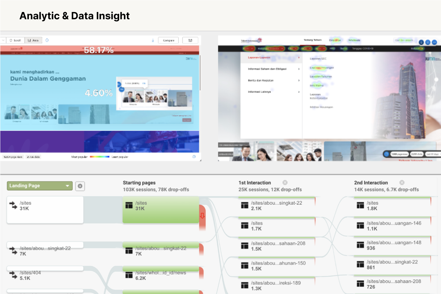
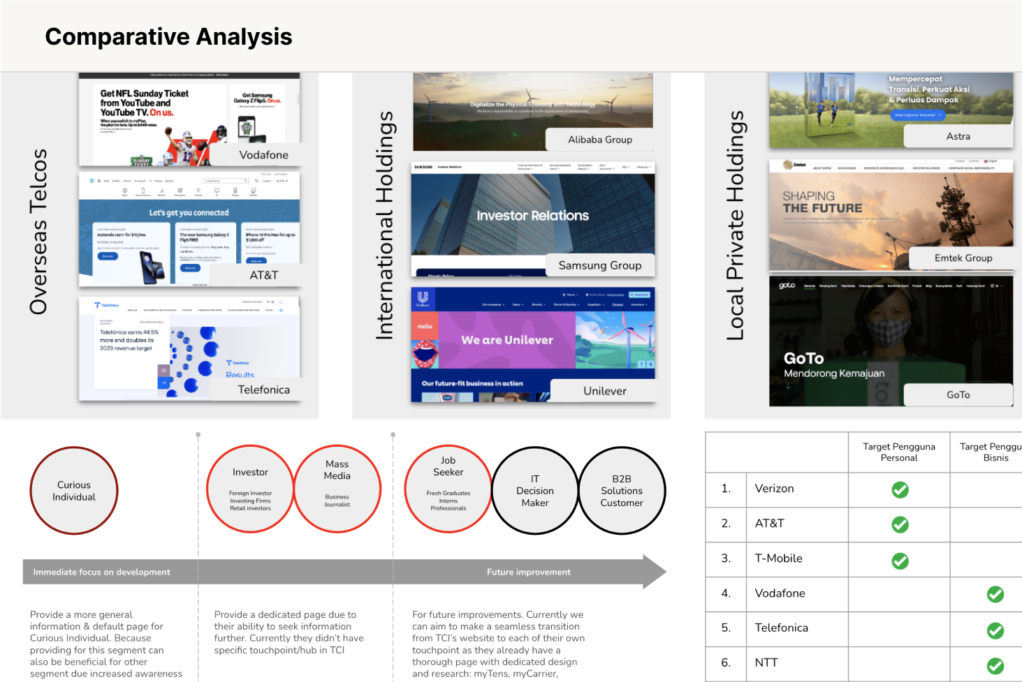
Discovery activities included workshops, interviews, data Insight, comparative analysis and define success metrics.
The discovery revealed several key challenges
Misalignment with shareholder needs, especially access to financial information, high demand but difficult access to media and investor content, an overly complex navigation structure, a design that failed to reflect Telkom’s digital identity, content that was hard to understand due to internal jargon, and a general lack of clarity about Telkom’s products and solutions.
Success metrics
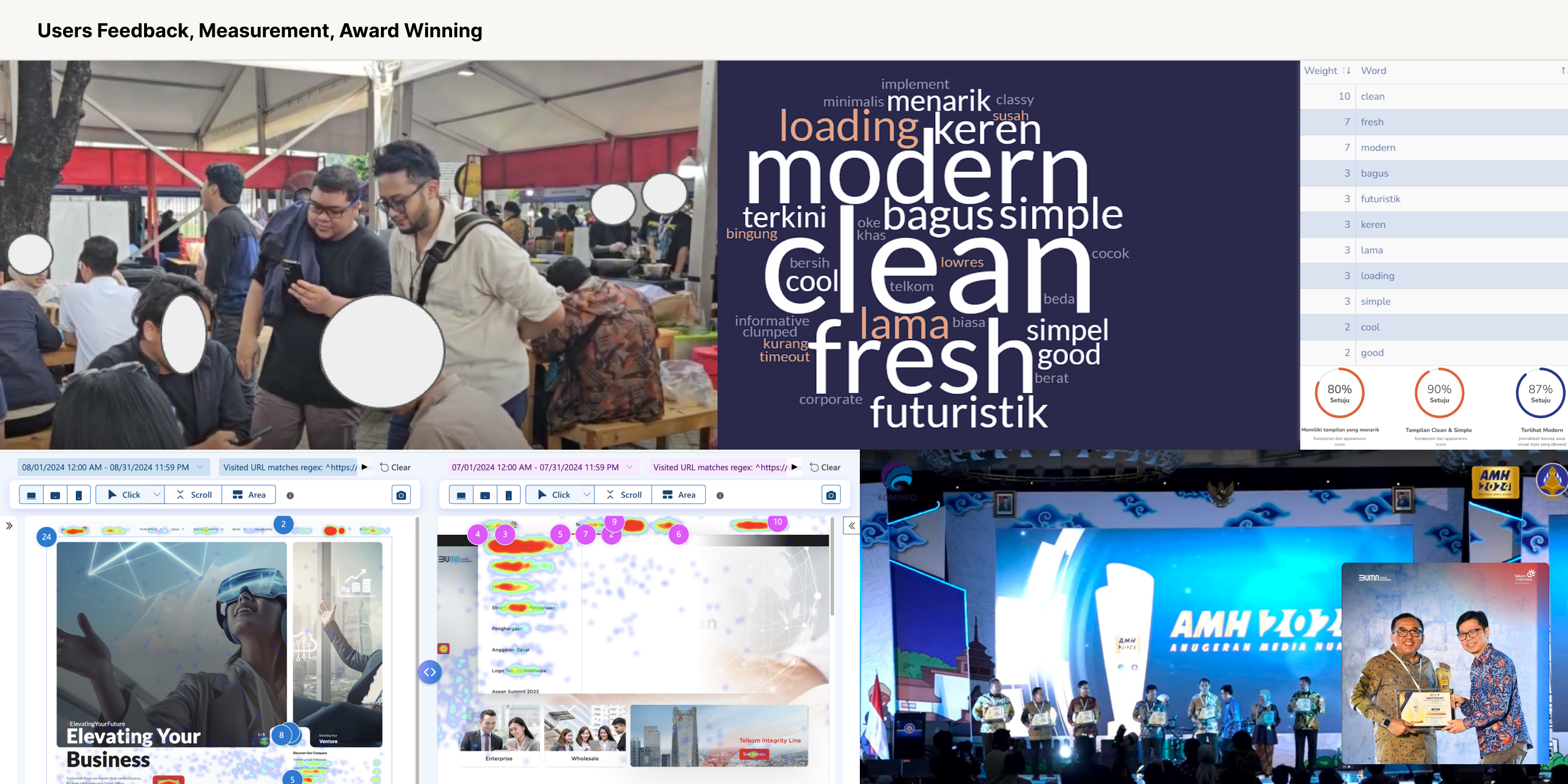
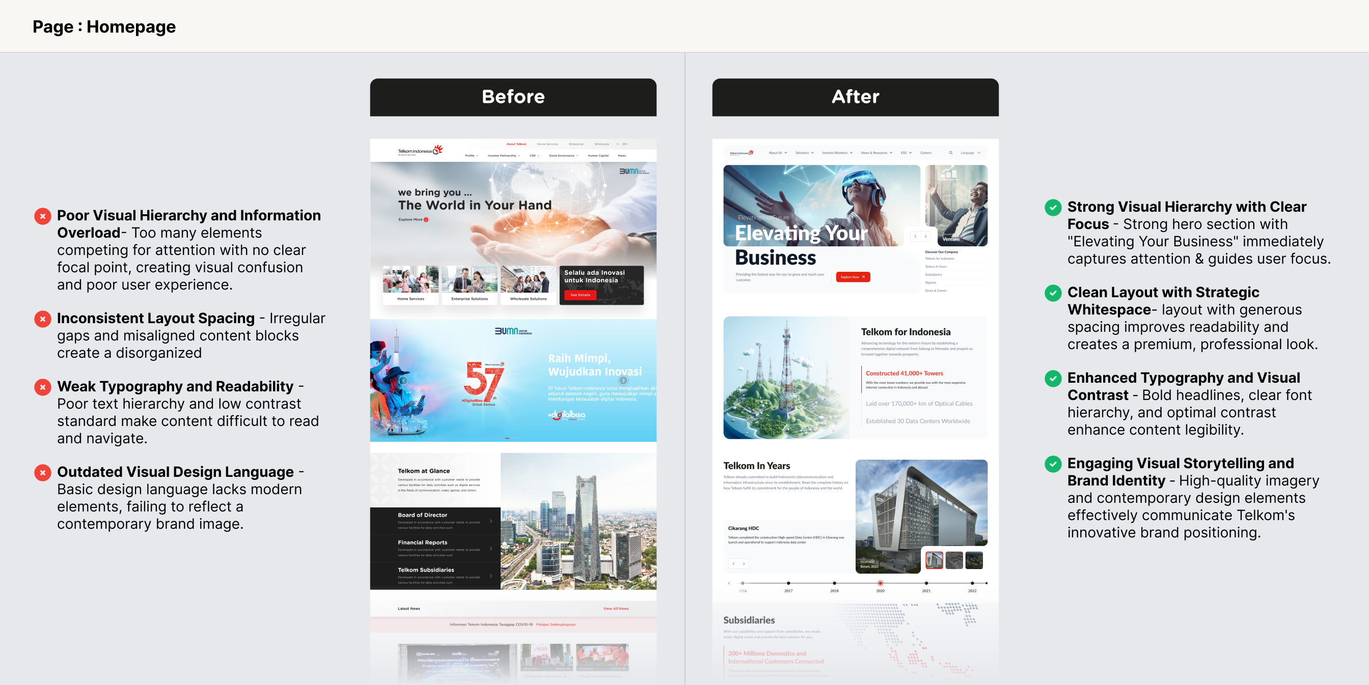
The redesign delivers a first impression that reflects a modern and futuristic digital company with 2x growth in Investor Relations page traffic, driving stronger visibility and engagement from stakeholders.
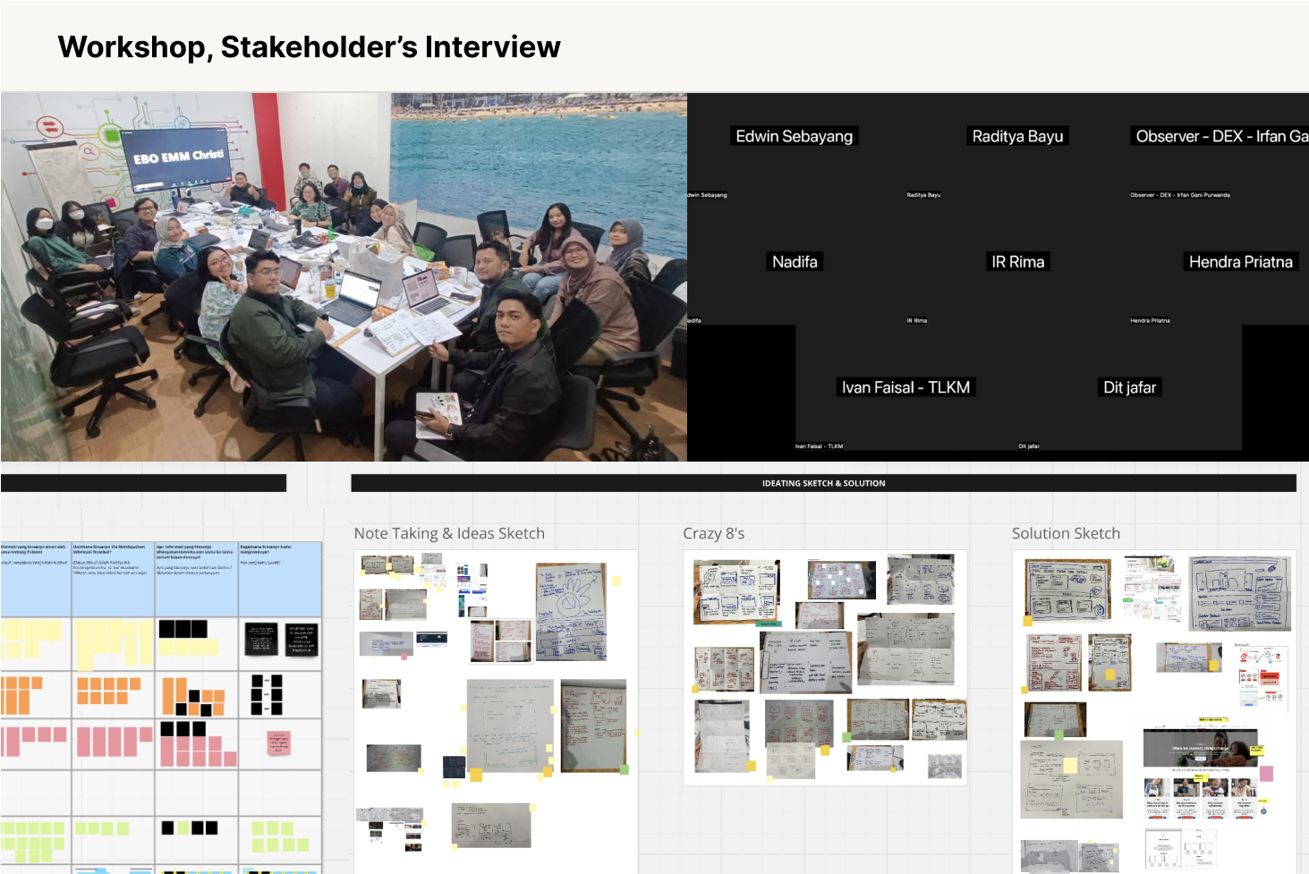
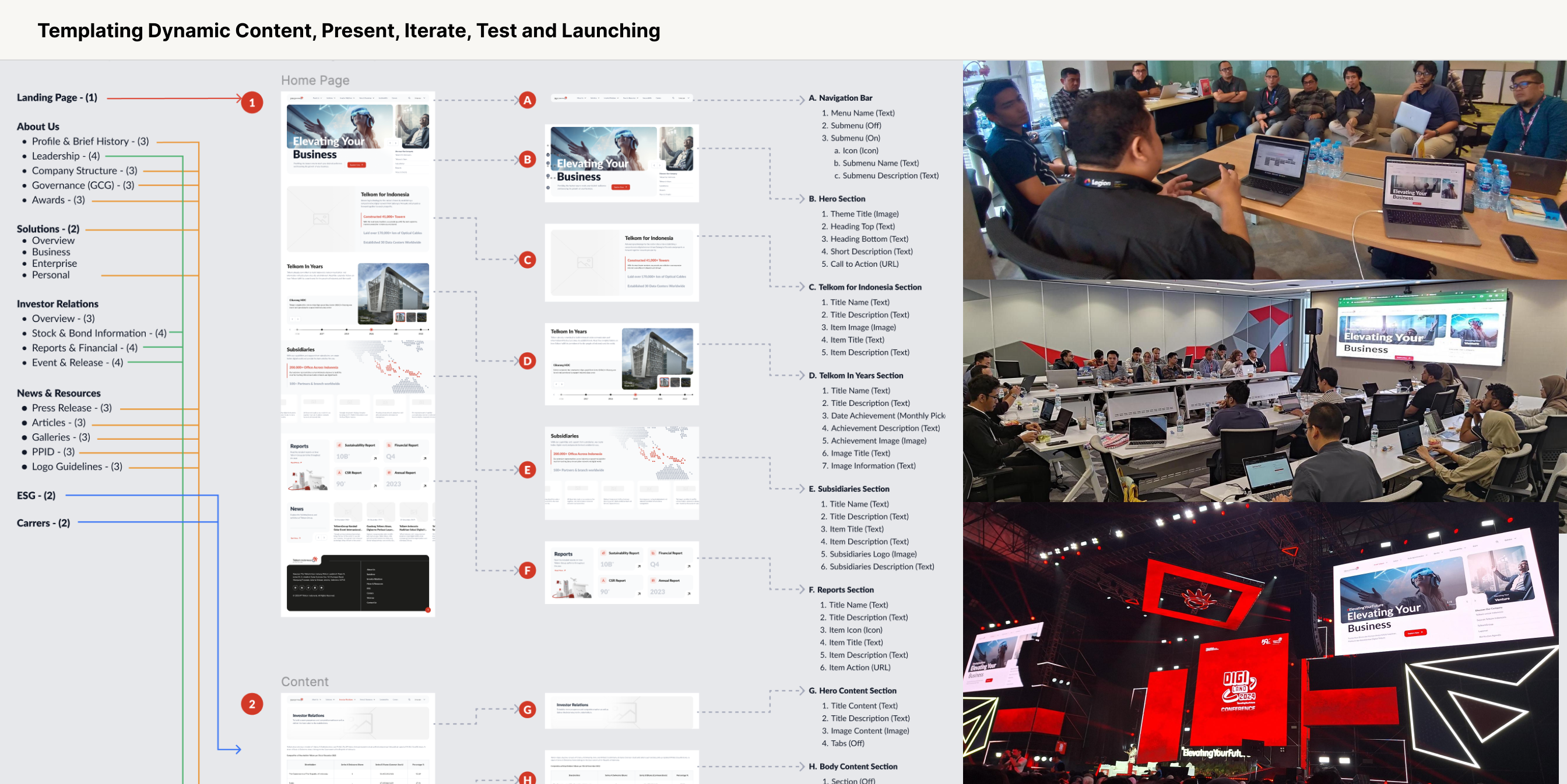
Start design with mapping the user and focussing create solustion base on challenge to achive success metric
The design revealed several steps
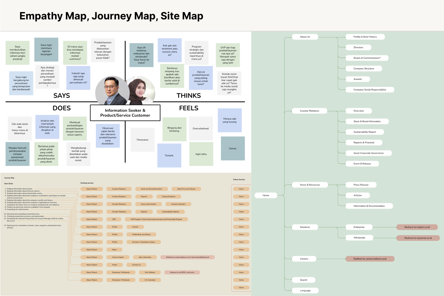
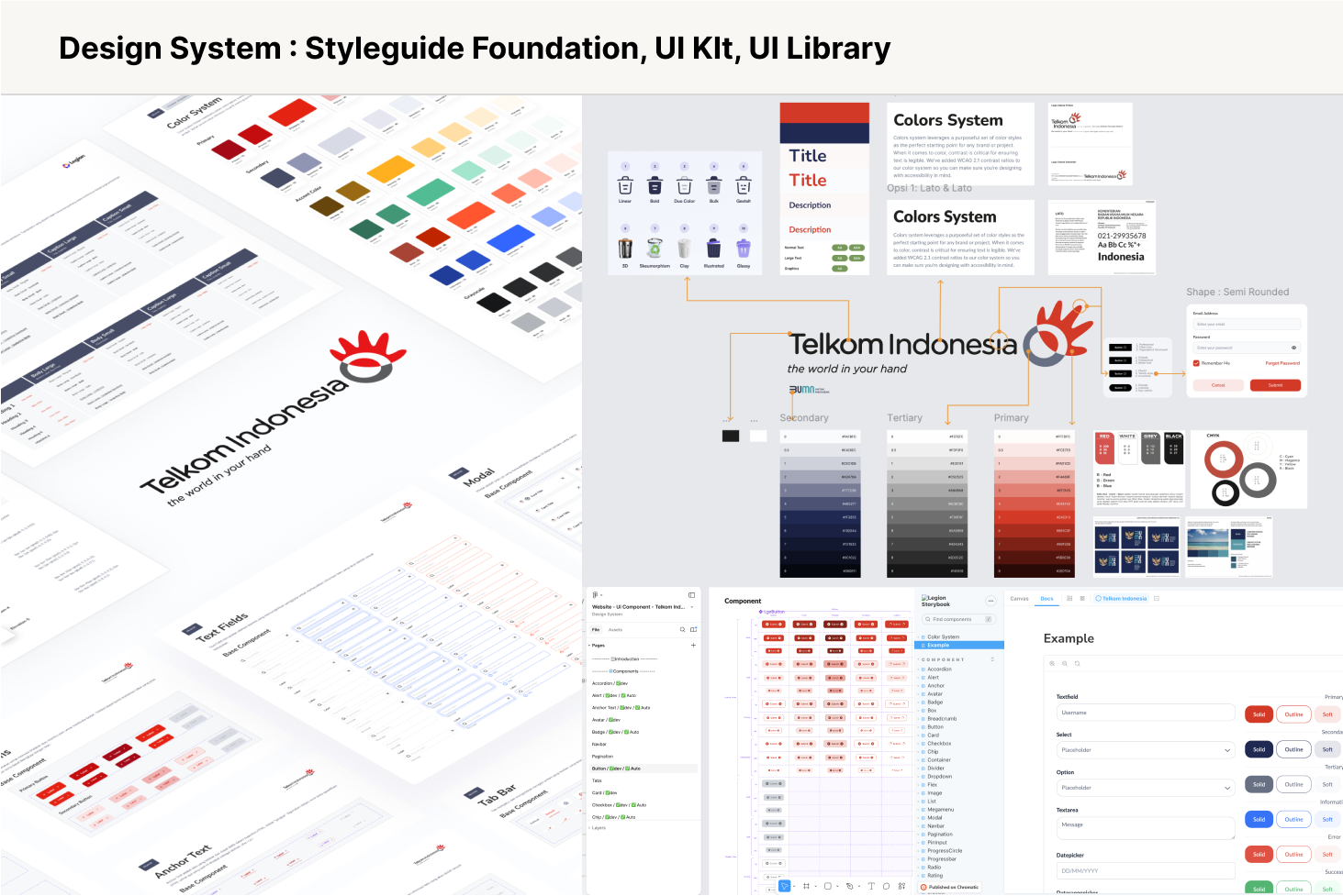
Guided by insights from the discovery phase, we crafted an empathy map, journey map, and sitemap to establish clear benchmarks for evaluation, solution ideation, and visualization of potential improvements. We then developed a brand personification, moodboard to define visual standards, conceptual direction, and copywriting tone. Before moving into interface design, we set up a comprehensive design system to ensure consistency and scalability across all visual outputs.
Solution
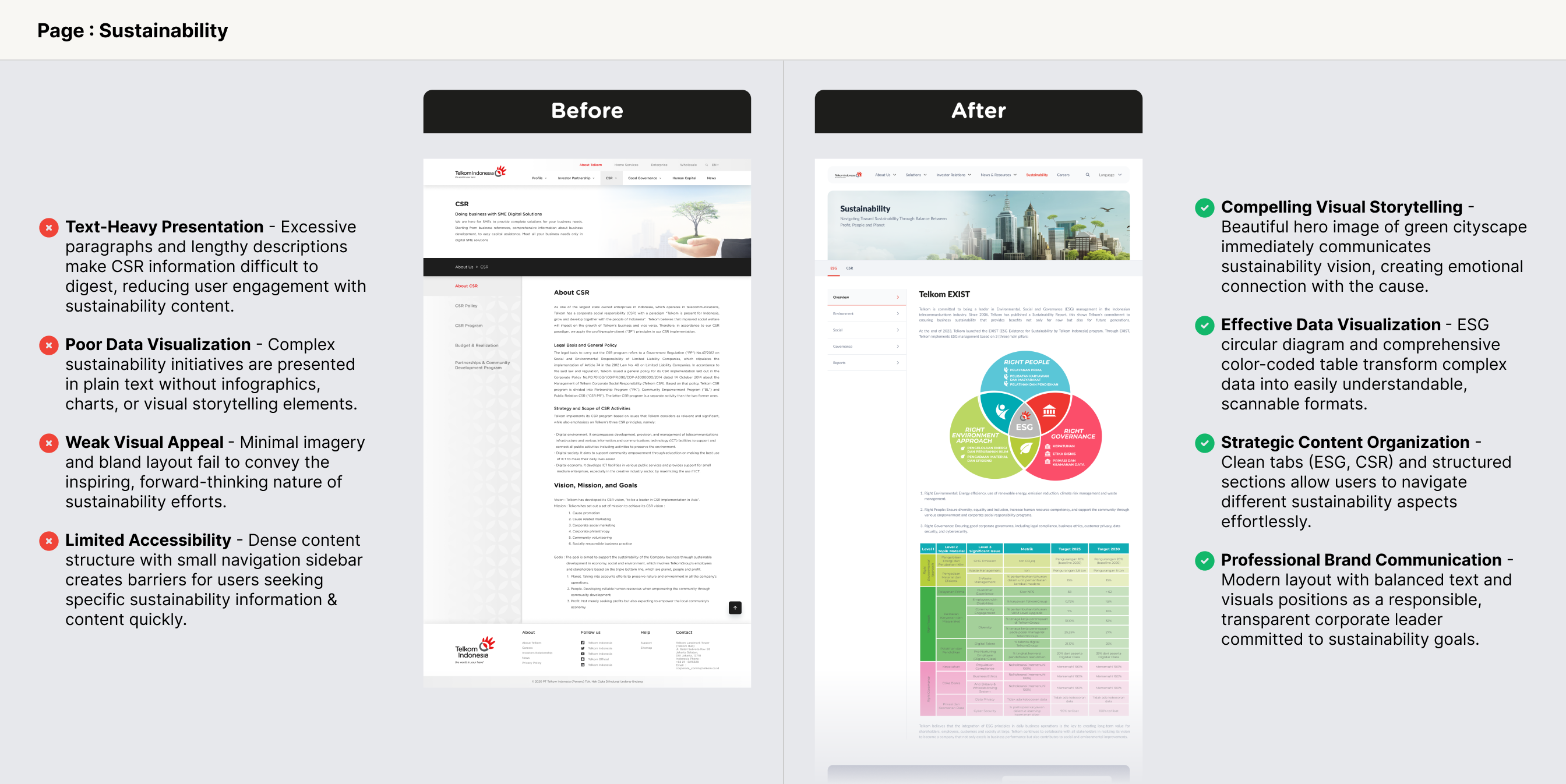
The redesign modernized Telkom’s identity as a holding company while making investor information more accessible and navigation more intuitive. By removing jargon and adding beginner-friendly content, the website became approachable for a wider audience, and was further positioned as a central hub connecting Telkom’s subsidiaries, solutions, and products.
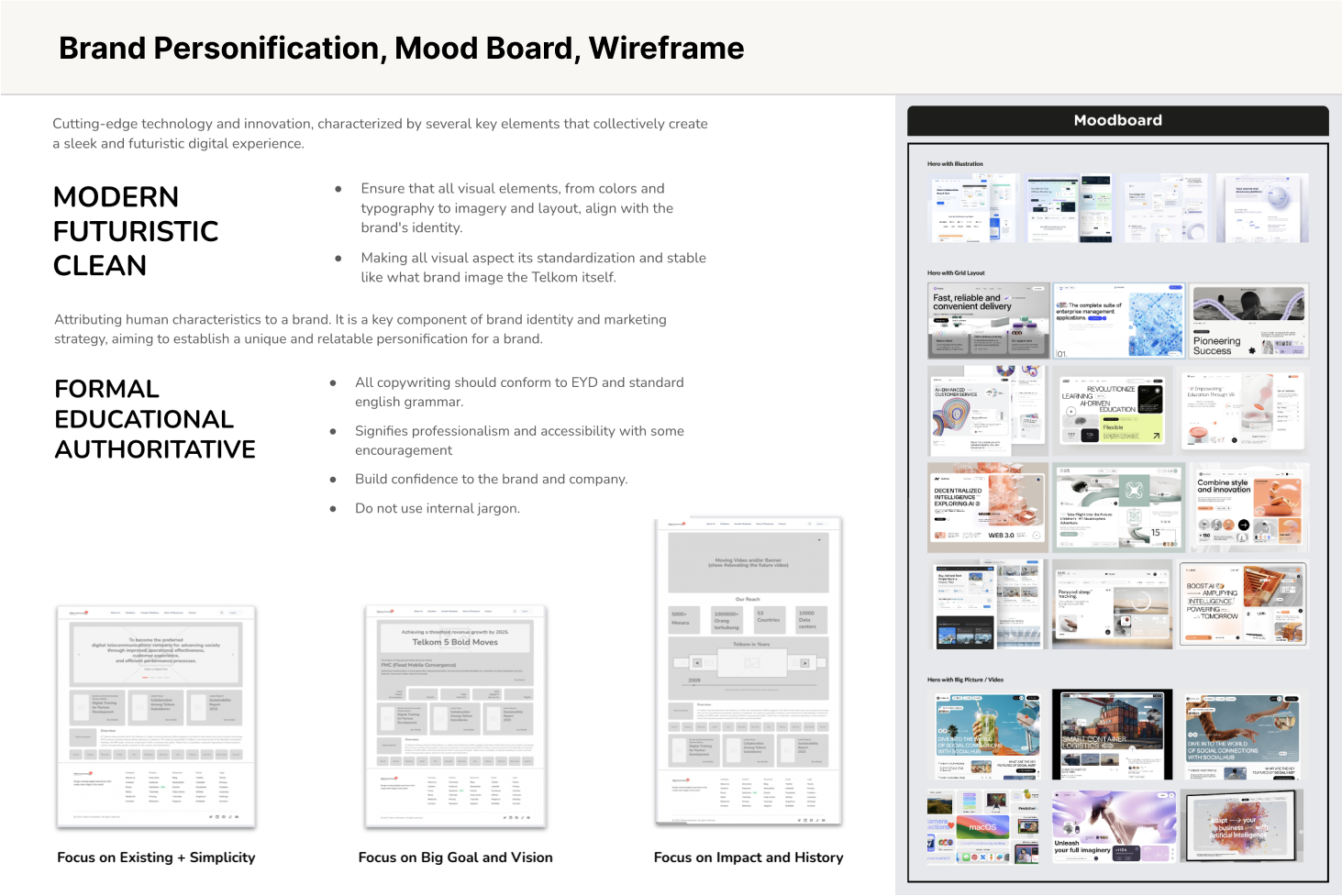
Modern, futuristic, clean visual style with a formal, educational, authoritative tone
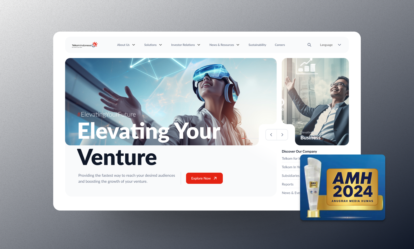
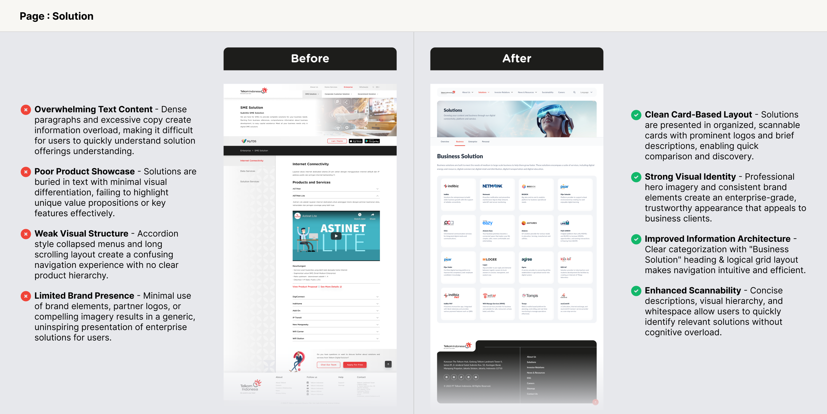
On the homepage, the layout is updated and a semi-rounded design style is applied to align with the brand personification with contect positioning Telkom more prominently as the holding company. The investor relations page highlights key information and shortcuts in a bold and engaging. The solutions page presents a product catalogue with clear calls to action to encourage detailed views and increase conversions for products.
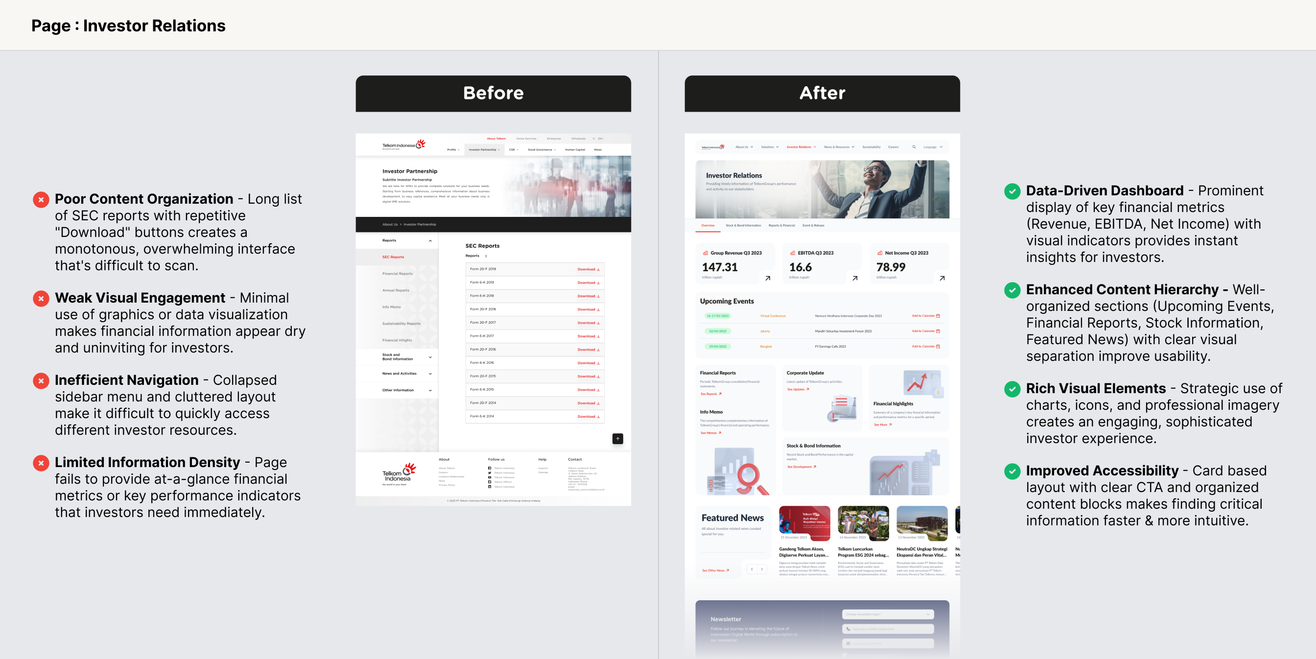
Redesign impact: 400%+ increase in Investor Relations page traffic
Successfully delivered the intended brand persona, with user feedback affirming its modern and clean appearance. The Investor Relations page achieved a 5x or 400%+ increase in traffic, while overall website traffic 2x to 42,569 visitors. The redesign also drove higher engagement from returning visitors and positively correlated with stock performance one month after launch. Notably, the website was honored with the prestigious Best Website Award at AMH 2024.