Introduction
Color is more than just decoration, it’s communication. Yet, many designers struggle with how much of each color to use in an interface. That’s where the 60–30–10 rule comes in.
This timeless principle, borrowed from interior design, offers a simple yet powerful framework for color composition — ensuring harmony, hierarchy, and consistency in any digital product.
1. Understanding the 60–30–10 Rule
The 60–30–10 rule provides a clear framework for distributing colors in a layout:
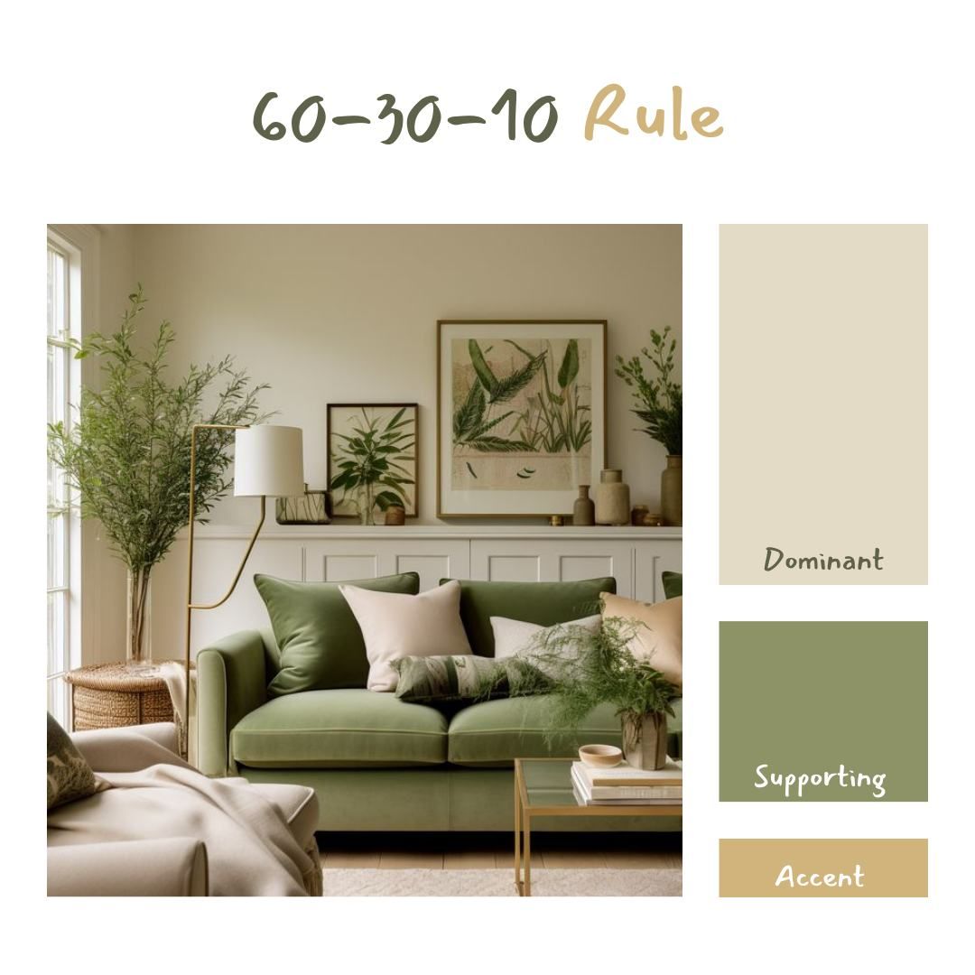
- 60% — Tertiary / Neutral Color:
This forms the foundation of your design. Usually composed of neutral tones like white, light gray, or beige, this color dominates the background, large surfaces, and whitespace.
Its main goal is to create balance and readability, ensuring that other elements stand out without visual clutter. - 30% — Secondary / Accent Color:
The accent color provides contrast and visual rhythm. It’s used for secondary buttons, illustrations, navigation bars, or cards.
This color supports the overall theme, adds structure, and helps group related UI elements. - 10% — Primary / CTA Color:
The primary color is your call-to-action driver — the most vibrant tone in your palette. It’s used sparingly for buttons, key icons, links, and interactive highlights.
Because it only takes up 10% of the interface, it naturally attracts attention and improves usability by clearly indicating where users should take action.
This ratio keeps your interface balanced and visually appealing while emphasizing what truly matters, your primary actions and user flow.

Why the 60–30–10 Rule Works in Digital Design
The human brain craves visual order. When color ratios are unbalanced, users feel overwhelmed or lost. The 60–30–10 structure helps:
- Create visual hierarchy: Users instantly know where to look and what matters.
- Reinforce brand identity: Primary colors stay consistent and recognizable.
- Improve accessibility: Balanced contrast ensures readability and focus.
- Maintain harmony: Interfaces feel cohesive, calm, and professional.
Why This Ratio Works
The power of the 60–30–10 rule lies in visual hierarchy and psychological comfort. Humans are naturally drawn to contrast and proportion. The 60-30-10 balance ensures that your design feels structured while keeping user focus where it should be.
From a psychological standpoint, it reduces cognitive overload and builds familiarity across screens. Users instinctively understand hierarchy, even without consciously analyzing it.
By distributing colors strategically:
- The 60% neutral base provides calm and focus.
- The 30% accent color introduces character and brand personality.
- The 10% CTA color guides attention and reinforces intuitive interaction.
In short, this rule helps create visual stability and ensures every color serves a purpose.
Implementing the Rule in UI/UX Design
When applying this rule, consistency is key. Here’s how you can translate it into practical UI work:
1. Start with Neutrals (60%)
Use a neutral palette (grays, off-whites, soft blues) for your background, containers, and text areas. This ensures content readability and prevents color fatigue — essential for digital interfaces that users interact with frequently.
2. Add Accents (30%)
Introduce accent colors in supporting elements like sidebars, icons, charts, or illustrations.
This layer should complement your brand identity and subtly reinforce structure without competing with your main CTAs.
3. Highlight with Primary CTAs (10%)
Apply your strongest brand color to the most important interactive elements: buttons, links, and key actions. Because this color appears sparingly, users instinctively associate it with “action” — making the design more intuitive.
Common Mistakes to Avoid
- Overusing CTA colors — when every button is bright, nothing stands out.
- Ignoring accessibility — ensure your color contrast meets WCAG standards for text and UI elements.
- Lack of consistency — don’t let color distribution vary drastically across pages; users rely on
Tips for Designers
- Start from Neutrals – Build your layout using grayscale first, then apply colors by ratio.
- Maintain Contrast – Ensure your CTA color stands out against the neutral background.
- Be Consistent – The same ratio can apply across pages to create visual continuity.
- Test in Dark and Light Modes – The 60-30-10 balance helps maintain accessibility and readability in both themes.
- Use Real Data – Apply your palette to real components (not mockups) to see how it performs in context.
Real-World Examples
- Google Workspace: Dominant neutral whites and grays (60%), blue accents (30%), and a bright CTA blue (10%).
- Apple’s Website: Minimalist grayscale base (60%), subtle product accents (30%), and call-to-action highlights in blue or black (10%).
- Slack: Muted purples and neutrals (60%), vibrant accent illustrations (30%), and bold buttons (10%).
Each uses the rule differently, but all achieve clarity, consistency, and emotional balance.

Final Thoughts
The 60–30–10 color rule is not a strict formula, but a guideline as a compass for visual balance.
When applied thoughtfully, it transforms interfaces from cluttered to cohesive, from confusing to intuitive.
Remember: great UI design is not about adding more color; it’s about using the right amount of it, in the right proportion.